Missing People Map
Sometime around middle to late November of 2019, I started getting tagged in posts on Reddit and Facebook where a map purported to show a correlation between missing person cases and caves. The two maps in question were of terrible quality in both content and image quality (so very much JPG compression). Somehow these maps managed to capture the public's attention for several weeks. In fact, more than two months later I am still being asked questions about the map.

What follows is a critical analysis of the maps from both a cartographer's perspective, as well as a caver's.
Origin
Where did each image come from that comprised the map?
The top image is titled "North America Cluster Map" and is produced by the Canam Missing Project / Missing 411. I cannot comment on the methods used to produce the map since they aren't stated. For this reason I am immediately suspect that this is conveying real information. I'll touch on why the form of this map isn't correct later in Cartographic Analysis. Link to a higher resolution map here.
The bottom image was seemingly produced by Texas Parks and Wildlife as a support image for the webpage here. Some of their methods can be inferred by the documentation on the associated website. However, there are still design flaws that I will cover later.
What was the person thinking that put the two images together?
The meme originally seemed to pick up credibility when on October 28th it was posted to the Reddit forum r/Missing411 here: Do these images look similar? The top is a map of Missing 411 cases. The bottom is a map of America’s cave systems. Caves seem to play an interesting roll in some of these disappearances. The Mammoth Cave system in particular had caught my interest.
It was posted to r/MapPorn on November 15th here: Since I love true crime and cole cases- wow! where it picked up more credibility.
(You've got to love the titles of Reddit posts. Reddit user michaeljoemcc cleverly comments, "Slaw and Order: Cole Cases.")
This wasn't the first appearance of the meme however. In the comments of the r/MapPorn post Reddit user plural_of_nemesis identifies the original post with this comment, as well as points out some problems with the map:
If a student turned this map into me as a project they had worked on, I would reject it entirely for the following reasons:
1) Too much JPG. The image format JPG is a lossy data format. What that means is that you can compress the image for a minor loss in quality. As I process photographs I can choose to make the file size smaller by increasing compression, and for the most part no one will ever notice the difference. However, repeatedly opening and re-saving a JPG will result in increasing JPG artifacts.
Here is a funny example of too much JPG compression.
What follows is a critical analysis of the maps from both a cartographer's perspective, as well as a caver's.
Origin
Where did each image come from that comprised the map?
The top image is titled "North America Cluster Map" and is produced by the Canam Missing Project / Missing 411. I cannot comment on the methods used to produce the map since they aren't stated. For this reason I am immediately suspect that this is conveying real information. I'll touch on why the form of this map isn't correct later in Cartographic Analysis. Link to a higher resolution map here.
The bottom image was seemingly produced by Texas Parks and Wildlife as a support image for the webpage here. Some of their methods can be inferred by the documentation on the associated website. However, there are still design flaws that I will cover later.
What was the person thinking that put the two images together?
The meme originally seemed to pick up credibility when on October 28th it was posted to the Reddit forum r/Missing411 here: Do these images look similar? The top is a map of Missing 411 cases. The bottom is a map of America’s cave systems. Caves seem to play an interesting roll in some of these disappearances. The Mammoth Cave system in particular had caught my interest.
It was posted to r/MapPorn on November 15th here: Since I love true crime and cole cases- wow! where it picked up more credibility.
(You've got to love the titles of Reddit posts. Reddit user michaeljoemcc cleverly comments, "Slaw and Order: Cole Cases.")
This wasn't the first appearance of the meme however. In the comments of the r/MapPorn post Reddit user plural_of_nemesis identifies the original post with this comment, as well as points out some problems with the map:
Notice we can't see the key on the top map?Further commentary by u/BRENNEJM notes that "The original top map doesn’t even have the black parts on it." This certainly hints that the top map was modified with data from the bottom map. With the top map lacking a key anyone could be expected to assume every black dot on the top map is a missing person case, when in fact, it's cave locations from the bottom map.
The missing people are represented by the large orange dots in the top map, and it only includes people that have gone missing from national parks.
Edit: I found the original source of that top map. Black dots are literally just the location of caves. That's why they correlate so perfectly with the location of caves in the second map.
(link marked "b" in this thread) https://www.reddit.com/r/reptiliandata/comments/4ecdxs/maps_do_map_of_vaccine_makers_tv_stations_caves
Source: u/plural_of_nemesis
Cartographic Analysis
Mixing elements without a key or proper labels is a pretty serious flaw in the map design. This is just another strong example of why people shouldn't get information from memes.
If a student turned this map into me as a project they had worked on, I would reject it entirely for the following reasons:
1) Too much JPG. The image format JPG is a lossy data format. What that means is that you can compress the image for a minor loss in quality. As I process photographs I can choose to make the file size smaller by increasing compression, and for the most part no one will ever notice the difference. However, repeatedly opening and re-saving a JPG will result in increasing JPG artifacts.
Here is a funny example of too much JPG compression.
2) Cannot be read. None of the data labels, none of the legend items, nothing on the map can be read. What even are the colors on the top map trying to show us? How much information do you think anything can share if you cannot read what it is attempting to say? This is the result of the previously mentioned JPG compression, but is itself an entirely different flaw.
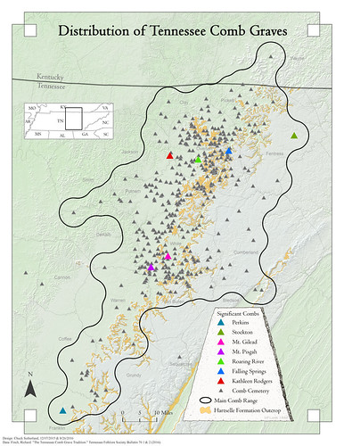
3) Improper Symbolization. Point data should only be used to symbolize infrequent data. In other words, hundreds of points on a map doesn't correctly convey density. Compare and contrast the following two maps I have made.
This map of Tennessee Caves uses a heat map to show densities of features. This is advantageous for a few reasons. At this scale a map of caves would look like a mess of points and would obscure most other map elements. Many points would be overlapping to the point where it generally seemed like a large blob. Points are inappropriate here and either a heat map or a choropleth map would work.
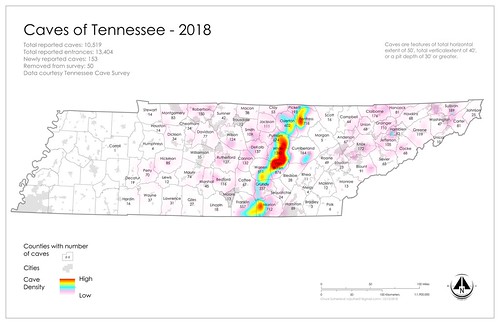
This map shows locations of Comb Graves. At the request of the author we left the point data in tact, despite my objections. Note that at the scale the map is produced at there are plenty of overlapping points and the overall design is very busy. Compare with the above map. Which better conveys information?
4) Where did they even get the data? As someone who has been caving for more than a decade and making state level density maps for a a few years, I would really like to know where their cave data came from. I have high level contacts across the United States and am generally a respected caver and I had to plea, debate, beg, sign contracts, and kiss butt to get the data for the handful of states I've managed to map (read more here: The Origins of Data, and the Future of State Cave Surveys).
The data on the bottom map doesn't match old public datasets on caves, like the GNIS data (which has since retired collecting cave entrance location data). It vaguely matches my data (which is likely the most complete cave entrance location collection within the USA). It best seems to match polygon data of karst areas provided by the USGS. But again I wonder where the points came from?
5) Where is the analysis? There are tools in modern GIS packages to compare datasets. Why can we not make an empirical analysis of the data and provide that?
6) Methods? The data on methods from the original post are suspect. The best guess I can make is they used Photoshop to layer the data.
7) Conclusions. Given the vast number of flaws found in this meme it is clear that it doesn't represent what it claims to represent. Can we stop sharing it now?
This map of Tennessee Caves uses a heat map to show densities of features. This is advantageous for a few reasons. At this scale a map of caves would look like a mess of points and would obscure most other map elements. Many points would be overlapping to the point where it generally seemed like a large blob. Points are inappropriate here and either a heat map or a choropleth map would work.
This map shows locations of Comb Graves. At the request of the author we left the point data in tact, despite my objections. Note that at the scale the map is produced at there are plenty of overlapping points and the overall design is very busy. Compare with the above map. Which better conveys information?
4) Where did they even get the data? As someone who has been caving for more than a decade and making state level density maps for a a few years, I would really like to know where their cave data came from. I have high level contacts across the United States and am generally a respected caver and I had to plea, debate, beg, sign contracts, and kiss butt to get the data for the handful of states I've managed to map (read more here: The Origins of Data, and the Future of State Cave Surveys).
The data on the bottom map doesn't match old public datasets on caves, like the GNIS data (which has since retired collecting cave entrance location data). It vaguely matches my data (which is likely the most complete cave entrance location collection within the USA). It best seems to match polygon data of karst areas provided by the USGS. But again I wonder where the points came from?
5) Where is the analysis? There are tools in modern GIS packages to compare datasets. Why can we not make an empirical analysis of the data and provide that?
6) Methods? The data on methods from the original post are suspect. The best guess I can make is they used Photoshop to layer the data.
7) Conclusions. Given the vast number of flaws found in this meme it is clear that it doesn't represent what it claims to represent. Can we stop sharing it now?


Comments
https://www.reddit.com/r/reptiliandata/comments/4dgpge/did_i_solve_missing_411_map_of_missing_people/
https://pubs.usgs.gov/gip/70043840/poster.pdf
https://webcache.googleusercontent.com/search?q=cache:2dk6J0DEMP0J:https://www.usgs.gov/faqs/why-are-there-no-entries-caves-geographic-names-information-system-database+&cd=9&hl=en&ct=clnk&gl=us
Let's clarify - there is the map, and there is the meme. The meme is useless. The map is useless at this resolution. The methods used to make the map weren't stated. The dude may have credibility, but I am suspicious of data without clear context or origin. And to be clear "suspicious" doesn't mean it's wrong, it just means that "before I invest time in believing it, I want to know how it was gathered." I know a lot of internet people have a problem with the word suspicious and think that it means "I don't trust you because you are wrong." It doesn't.
Or he is trying to spread or discredit the profile one or the other. My personal suggestion for anyone reading a map that they don't really understand is to try to research it. You clearly did a little research and linked it to Can-Am missing project but not enough to correlate the caves to The Missing 411 profile which would have become a parent had you watched even one or two of the many YouTube videos on the subject or perhaps watch the documentaries or read the books. Then you would have immediately understood what this individual was trying to say at least to a certain extent. It's also just a freaking meme. Anyway best wishes.
Jacob